Today we have an interesting experiment. Let’s take a huge load of data on NYSE share performance, do some filtering and forward the result into Gephi. Take a look below for some pretaste.
 Knowing which shares tend to move with each other can be valuable information in your market analysis. It’s up to you whether you want to learn about Stock Data Downloader / Gephi first or whether you want to get your insights straightaway – here we go.
The idea behind: How we match share prices
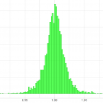
First things first: Obtaining a correlation coefficient for the relation between two shares is not rocket science! Take a look at the data points and bring pairs of data points – matching through time – together in a single scatterplot. If the data is scattered a lot then there is not much evidence for correlation. Do the points lie close to a line through the data points? Then a linear relationship seems reasonable. For an example of a strong and a weak linear correlation, see the illustration below.

How share prices correlate: For each point in time we try to match the share price; wide-spread data implies less correlation
In this article we work with large data sets containing information on many shares. Hence, it makes sense to summarize the relationship with a single number – the correlation coefficient. There are many correlation coefficients in use. To determine a linear relationship, the Pearson correlation coefficient is a good choice. In this article the Pearson correlation coefficient has been used. However, the relationship might be non-linear in some cases and then a ranked correlation coefficient like the one by Spearman would be a better choice.
Data Processing
Now, the calculation must be performed for all combinations available in our data provided by Stock Data Downloader. We make extensive use of the dplyr package in R and correlate share performance on a month-to-month basis.
Also, some substantial data cleanup is required. Think what happens, if we consider all correlations between shares: You wont’t see anything because there would appear approximately 3000² relations between the shares. So, we set a limit and only take such with a correlation coefficient of 0.9 and higher or -0.9 and lower into account.
Further, there might arise something which can be called “spurious correlation”. For instance, the financial crisis in 2008 led to a common drop in share prices. This may also have led to an increase in correlation between most shares. Since we want to use at least 10 years of data, we need to include 2008. Fortunately, a simple approach is to exclude such shares which are significantely correlated to more than a certain number of shares (here we use 8). Unfortunately, this will also remove some real strong correlations. You should always bear in mind that we only see an excerpt of the network of share price correlations here!
The R script produces a node and an edge output file containing the share related information and correlations respectively. These files are applicable for processing in Gephi. Gephi will produce a network graph from the node and edge file.
The resulting Network of Shares
You can donwload the Gephi project containing the full plot, here. The Gephi project requires you to install Gephi first. For simplicity, you can also click on the image below in order to increase its size. If you suffer from display issues in your browser (especially Firefox), you can right-click on the image and save it to your hard-disk.
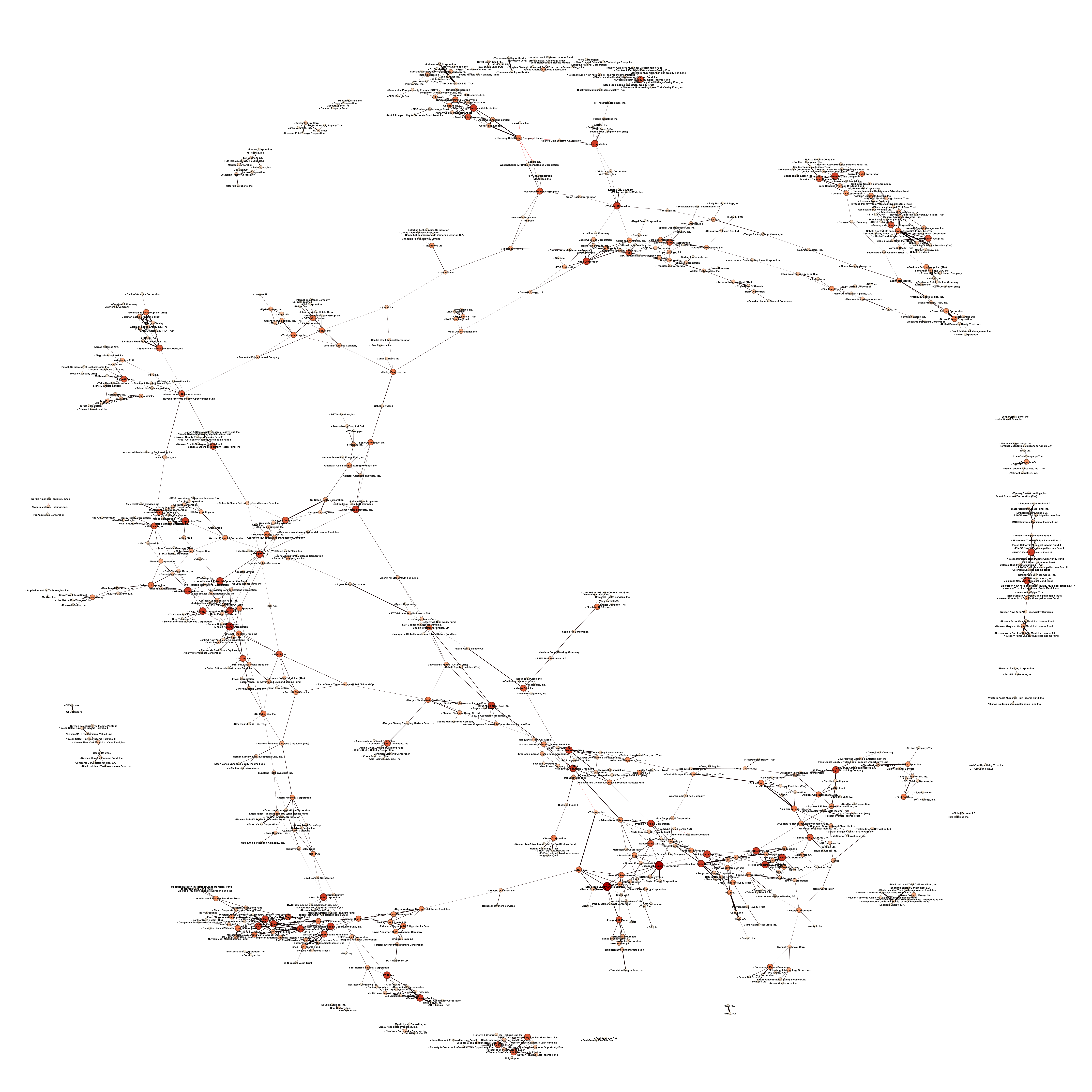
The resulting correlation network in NYSE with some constraints
Have fun with the data – investigate and verify it. For more benefit, you should check which shares move together and analyze why it happens. With this knowledge you will be able to make an informed decision.


Leave a Reply